
How to make sense of Wikileaks data? One way is visual analysis, as we see here, via Jonathan Stray of Associated Press:
Click the image for the high res version.
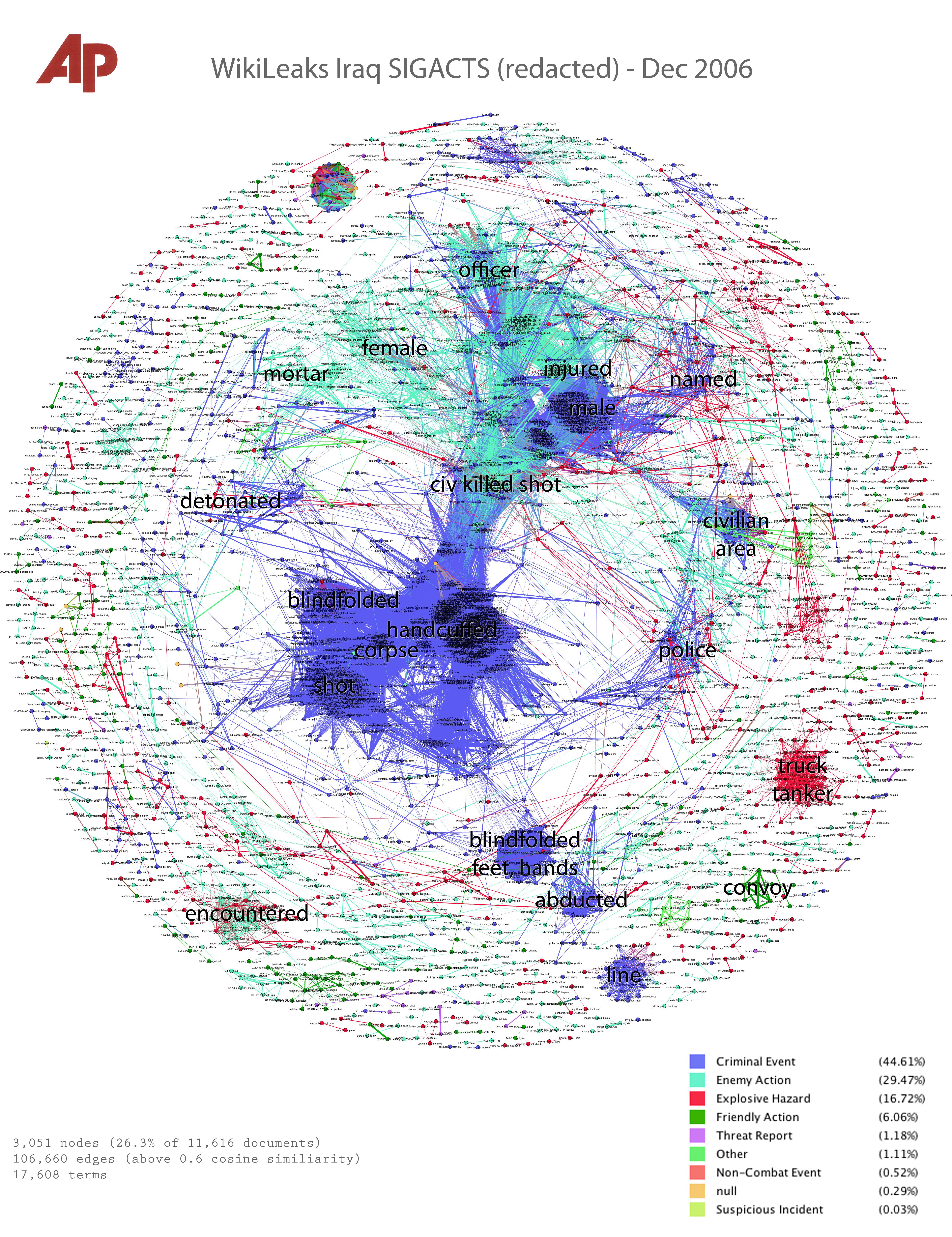
Stray and Julian Burgess created a visualization using data from December 2006 Iraq Significant Action (SIGACT) reports from Wikileaks. That was the bloodiest month of the war, and the central (blue) point on the visualization represents homicides, i.e. clusters of reports that are “criminal events” and include the word “corpse.” These merge into green “enemy action” reports, and at the inteface we have “civ, killed, shot,” civilians killed in battle. Stray tells how this was done, with some interesting notes, e.g.
…by turning each document into a list of numbers, the order of the words is lost. Once we crunch the text in this way, “the insurgents fired on the civilians” and “the civilians fired on the insurgents” are indistinguishable. Both will appear in the same cluster. This is why a vector of TF-IDF numbers is called a “bag of words” model; it’s as if we cut out all the individual words and put them in a bag, losing their relationships before further processing.
As a result, he warns that “any visualization based on a bag-of-words model cannot show distinctions that depend on word order.” (Much more explanation and detail in Stray’s original post; if you’re interested in data visualization and its relevance to the future of journalism, be sure to read it.)
Thanks to Charles Knickerbocker for pointing out the Stray post.